Readable type

Ideogram text rendering that keeps words readable

Ideogram text rendering is most useful when the words are central to the design: a title, label, sign, badge, or short message. Start with a clear text instruction, then review every character before publishing.

Free to start · review every word

Practical uses

Where designed text makes the difference

Use this focused workflow when a few readable words matter more than elaborate scene detail. Each route below supports a different part of the same visual process.

Brand teams

Create a compact campaign graphic with a product name, short slogan, and controlled color direction.

You can test several visual directions before handing a concept to a designer. For broader image ideation, see the ideogram generator.

ideogram generator
Poster makers

Turn an event title, date, and location into a visual poster with hierarchy built into the prompt.

The first draft gives you a composition to refine rather than a blank canvas. Stronger wording starts with deliberate ideogram prompts.

ideogram prompts

Creators building recurring characters

Pair a short title or speech element with a consistent illustrated subject across multiple concepts.

You can separate character direction from lettering decisions, then iterate on both. For continuity-focused work, explore ideogram character.

ideogram character

Small business owners

Mock up menu boards, packaging labels, storefront signs, or social announcements without assembling every layer first.

Readable draft artwork helps you choose a direction quickly and identify which details need manual finishing. The ideogram generator is useful when the text is secondary.

ideogram generator

Simple workflow

How to begin with intentional lettering

Keep the first request short and specific. Ask for the exact wording, its placement, and the visual treatment instead of describing every possible detail at once.

  1. 1

    Write the exact words

    Put the required wording in quotation marks and keep it short. Include capitalization, punctuation, and any number that must appear.

  2. 2

    Describe hierarchy and placement

    Say which line is the title, where it should sit, and how it should relate to the subject. Terms such as centered, stacked, small label, or bold headline give the layout direction.

  3. 3

    Inspect and refine

    Check spelling, spacing, and missing characters at full size. If one detail fails, simplify the prompt or revise only that part rather than adding more competing instructions.

Workflow comparison

Focused lettering or general image making?

Both approaches can produce useful concepts, but they prioritize different signals. Choose the focused route when the wording itself will decide whether the image works.

Text-focused workflow
General image workflow

Primary goal

Text-focused workflow

Make short, visible wording part of the composition

General image workflow

Build a complete scene, subject, or visual atmosphere

Best input

Text-focused workflow

Exact phrase plus placement, hierarchy, and style

General image workflow

Subject, setting, mood, lighting, and camera direction

Typical use

Text-focused workflow

Posters, labels, signs, titles, badges, and announcements

General image workflow

Portraits, landscapes, product scenes, and concept art

Revision focus

Text-focused workflow

Spelling, line breaks, alignment, and letter treatment

General image workflow

Pose, framing, color, texture, and environment

Prompt length

Text-focused workflow

Short and controlled

General image workflow

Often broader and more descriptive

Finishing expectation

Text-focused workflow

Still inspect every character and export at a useful size

General image workflow

Still review composition, anatomy, detail, and overall coherence

When to switch

Text-focused workflow

Use it when readable words are the design's main subject

General image workflow

Use the general route when text is incidental or can be added later

Plan the pass

Estimate the review effort before you generate

This small planning model treats each ten words as one review unit. It is not a platform limit or a price quote; it simply shows why shorter copy is easier to inspect.

Estimated output size

review units

Estimated correction cost

work units

Manual review time saved

minutes

Know the edges

What this workflow cannot guarantee

Generated lettering has improved, but it is not the same as typesetting. Treat the result as a visual draft whenever the wording is legally, commercially, or informationally important.

Perfect spelling every time

A request for exact wording can still produce a missing, altered, or substituted character, especially in longer phrases.

Workaround

Keep copy short, place it in quotation marks, and proofread the final image at full resolution.

Long paragraphs as finished layout

Dense body copy, complex tables, and multi-line instructions are difficult to keep consistent inside one generated image.

Workaround

Generate a visual direction, then set the final copy in a design or layout tool.

Guaranteed brand typography

A named font or precise letterform specification may be interpreted loosely rather than reproduced exactly.

Workaround

Describe the qualities you need, such as narrow sans serif or hand-painted serif, and replace the lettering when exact brand fidelity matters.

Reliable tiny text

Small labels and distant signs may look convincing at a glance but become unclear when enlarged or printed.

Workaround

Use fewer words, increase the intended text scale, and create a separate high-resolution finishing pass.

See the difference

From visual idea to readable draft

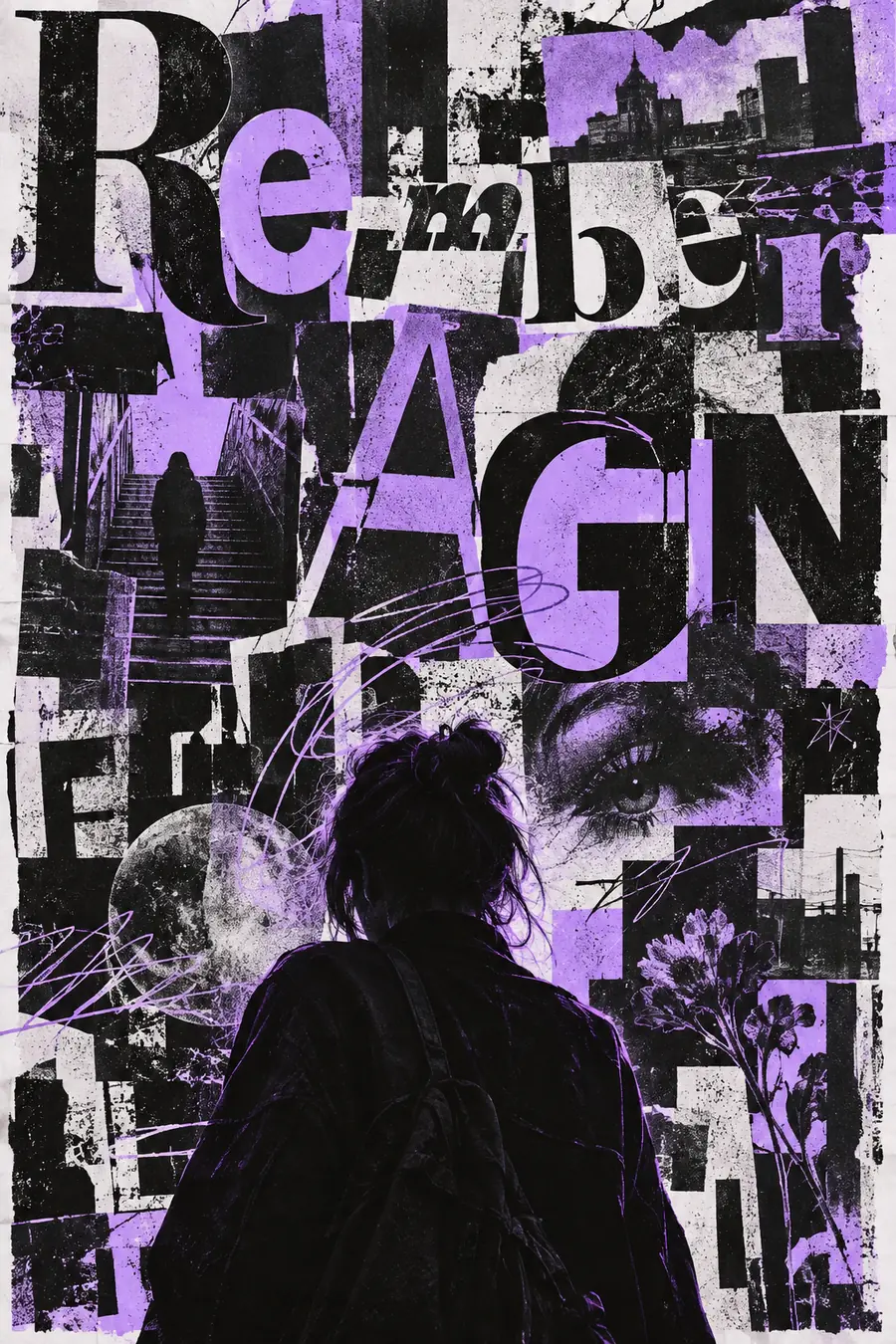
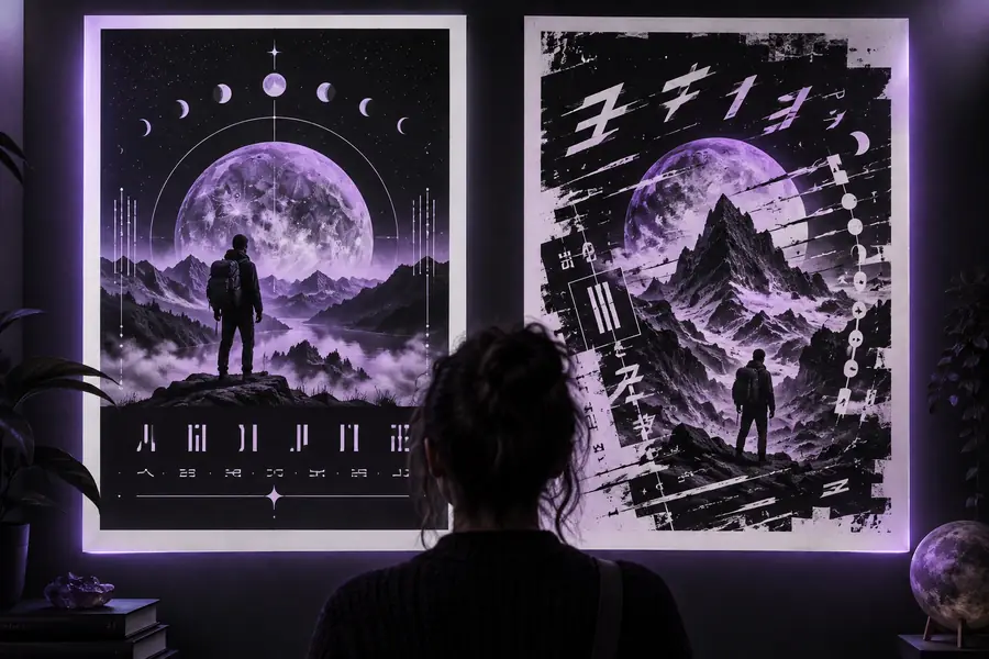
The first pass can suggest the right composition while the refined pass gives the wording more room and hierarchy. Use the pair as a review mindset, not as a promise that every character will be perfect.

Initial generated graphic with crowded lettering Initial pass
Refined graphic with clearer headline placement Refined pass
Shorter copy and stronger hierarchy make inspection easier.

Text questions

Ideogram text rendering FAQ

You describe the exact words, their placement, and the visual treatment in the prompt. The image model then attempts to draw that wording as part of the composition, so the result should always be proofread.

It can produce useful drafts for short poster headlines, labels, badges, and logo concepts. Exact spelling, brand typography, and production-ready lockups may still require manual correction.

Lettering is generated as visual content rather than placed through a conventional typesetting engine. Long phrases, tiny text, unusual punctuation, and competing visual details can make errors more likely.

Give the exact phrase in quotation marks, specify capitalization, and explain whether it is a headline, label, sign, or caption. Also describe placement, scale, line breaks, and the surrounding style without adding unnecessary copy.

Start creating
Start creating