Visual language guide

Ideogram vs pictogram: choose the right visual language

Ideogram vs pictogram is less a contest than a category check. One usually refers to an image-making tool or an idea-based symbol; the other is a compact visual sign designed to communicate quickly.

Verdict first

The verdict: tool, symbol, or both?

Choose Ideogram when you need expressive images, concepts, or text-led visuals. Choose a pictogram when a single, repeatable sign must communicate an action or object at a glance.

Ideogram

Our pick

Best for creating or exploring rich visual ideas.

  • Supports detailed scenes, illustrations, posters, and concept directions.
  • Allows visual variation when the brief is still evolving.
  • Can combine imagery, mood, composition, and readable design elements.
  • Useful when the output needs to feel distinctive rather than standardized.
  • A generated image may need review, editing, or several iterations.
  • It can be more visual information than a user needs for a simple instruction.
  • Results depend on how clearly the prompt describes the intended message.
Pictogram

2

Best for fast, consistent communication through a simple sign.

  • Communicates familiar objects, actions, and warnings with very little space.
  • Works well across signage, interfaces, maps, labels, and instructions.
  • Can be repeated as a coherent icon system with fixed rules.
  • Usually easier to reproduce at small sizes and in one color.
  • A pictogram is limited when the message depends on atmosphere or narrative detail.
  • Abstract or culturally specific ideas may be difficult to express clearly.
  • A rigid icon style can feel too plain for campaigns, editorial work, or concept art.

Core differences

Dimension by dimension

The most useful comparison is functional: ask what the visual must communicate, how much variation it needs, and where people will encounter it.

Ideogram
Pictogram

Primary role

Ideogram

Create or communicate a broad visual idea through an image.

Pictogram

Represent an object, action, place, or instruction with a compact sign.

Typical detail

Ideogram

Can include characters, environments, texture, lighting, layout, and typography.

Pictogram

Uses simplified shapes and a small number of recognizable visual cues.

Message speed

Ideogram

Invites interpretation and may communicate several ideas at once.

Pictogram

Designed for rapid recognition, often before the viewer reads supporting text.

Best scale

Ideogram

Most effective when the viewer has enough space and time to inspect the image.

Pictogram

Designed to remain legible in small interface, label, or signage contexts.

Consistency

Ideogram

Can vary from one generated or designed image to the next unless a system is enforced.

Pictogram

Usually follows a fixed grid, stroke, proportion, and style system.

Emotional range

Ideogram

Strong for mood, atmosphere, storytelling, and visual identity exploration.

Pictogram

Strong for neutral, direct, and practical communication.

Production process

Ideogram

Starts with a concept or prompt, then often moves through selection and refinement.

Pictogram

Starts with a defined meaning, then reduces it to the clearest visual form.

Typical output

Ideogram

A finished image, campaign visual, illustration, poster, or concept direction.

Pictogram

An icon or sign used repeatedly in a visual language.

Choose by context

Who each option suits

The right choice depends on the viewer’s task. If people need to understand a system instantly, reduce the message; if they need to feel, imagine, or explore it, expand the image.

Choose this when

You are making a poster, concept image, editorial illustration, campaign visual, or social asset.

Choose Ideogram.

The brief benefits from composition, atmosphere, visual variety, and the ability to test several creative directions before settling on one.

Choose this when

You are labeling an elevator, restroom, airport route, app action, product status, or safety instruction.

Choose a pictogram.

The viewer needs a compact sign that can be recognized quickly, reproduced consistently, and understood without a long explanation.

Choose this when

You need both a memorable image and a clear navigation or action system.

Use both at different layers.

Let the pictogram handle wayfinding or interface meaning, while Ideogram supplies the expressive background, campaign image, or supporting visual story.

From idea to system

A practical migration path

If a project has grown from one expressive image into a repeatable communication system, move from image exploration to symbol definition in deliberate steps.

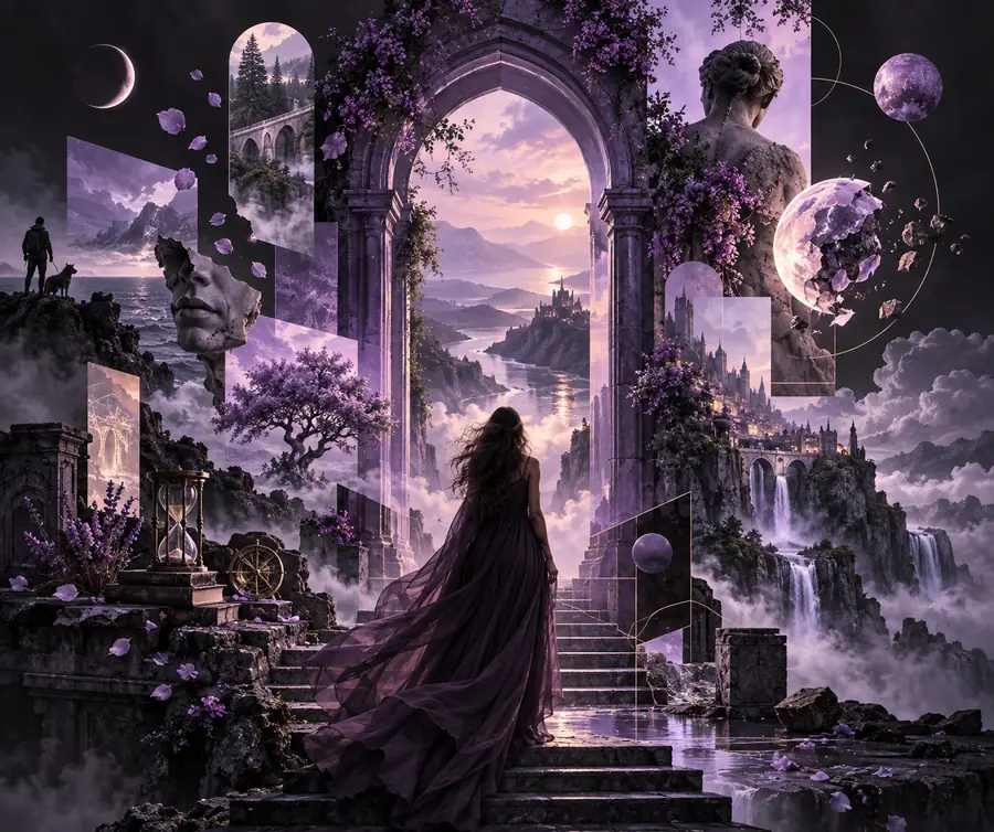
An expressive visual concept with layered imagery and detail Explore with Ideogram
A simplified pictogram-style visual reduced to a clear symbol Reduce to a pictogram
Keep the meaning stable as the form becomes simpler.
Define the single action, object, or idea the visual must communicate.
1 message
Separate the expressive image layer from the functional symbol layer when a project needs both.
2 layers
Test recognition, legibility, and cultural clarity before publishing a pictogram.
3 checks
Do not rely on decoration alone to explain an unfamiliar symbol.
0 assumptions

Important limits

A good choice also respects the limits of the medium. Neither an expressive image nor a pictogram should be asked to solve every communication problem.

Ideogram cannot guarantee instant recognition

A detailed image may be attractive but still take time to interpret, especially at a distance or in a busy interface.

Workaround

Add a short label, directional cue, or dedicated pictogram when speed matters.

A pictogram cannot carry every nuance

A simplified sign is weak at expressing atmosphere, character, product personality, or a complex narrative.

Workaround

Pair it with supporting copy or an expressive image instead of forcing all meaning into one icon.

Neither format removes cultural ambiguity

Symbols that seem obvious in one region or audience may be unfamiliar, misleading, or offensive in another.

Workaround

Test with representative users and provide text or local conventions where the stakes are high.

A generated image is not automatically a symbol system

Several attractive images may still differ in stroke, perspective, proportions, and visual logic, making them poor icons together.

Workaround

Define a pictogram grid and redraw or simplify selected elements into a consistent family.

Final questions

Comparison FAQ

These answers resolve the most common meaning and workflow questions behind this comparison.

An ideogram communicates an idea through a visual form, while a pictogram usually represents a concrete object, action, or instruction with a simplified sign. In everyday design work, the key difference is how much interpretation and detail the visual is expected to carry.

Ideogram can help you explore visual concepts, but a generated image is not automatically a production-ready pictogram. If you need an icon system, use the image as a starting point and simplify, standardize, and test the result before deployment.

Use a pictogram for most signage because signs need quick recognition, consistency, and legibility at different sizes. Ideogram may still help during the concept stage, especially when exploring the setting, mood, or visual direction around the sign.

Yes. A pictogram can provide the functional cue while an Ideogram-made image supplies context, emotion, or visual interest. Keeping those roles separate usually makes the final design clearer than asking one detailed image to behave like an icon.

Start creating
Start creating